SEARCH

|
|
|
|


Dear all,
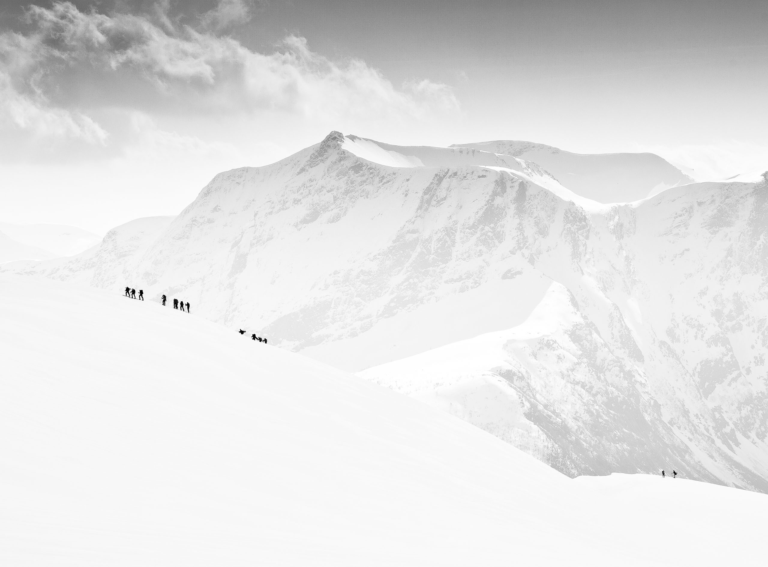
I took this photo based on the idea of mixing simple shapes, colors and contrast to make it more interesting. I have to crop the photo becuase I don't have long enough focal length to get rid of unwanted part.
Please feel free to provide yout comment.
Hello Tepsarit,
thank you for uploading your photo to this forum. It is an interesting composition and capturing certain details in urban space.
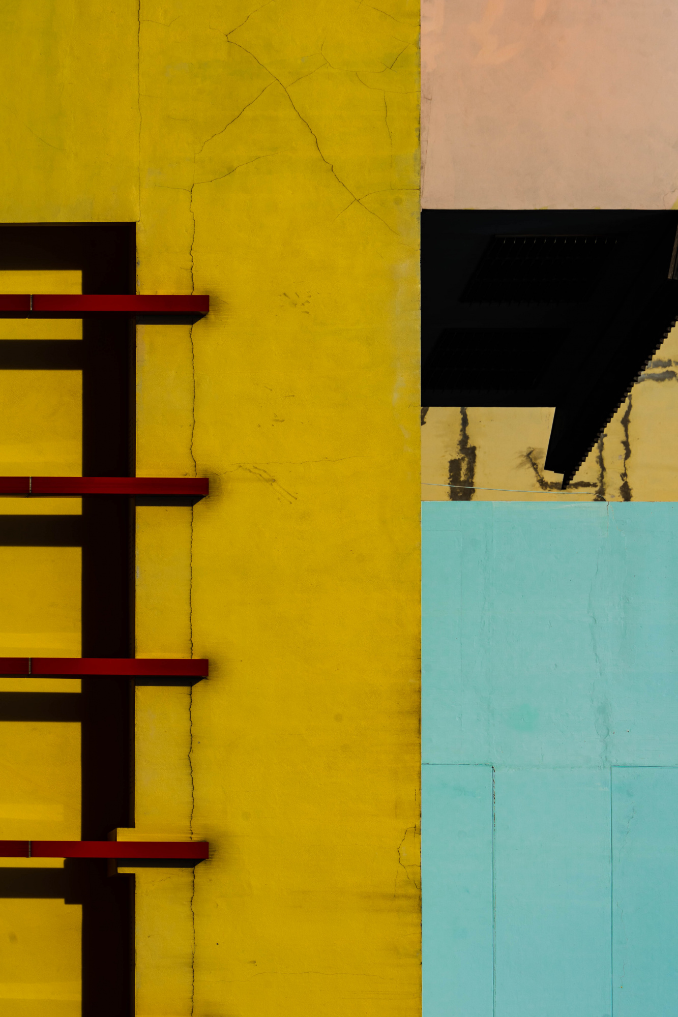
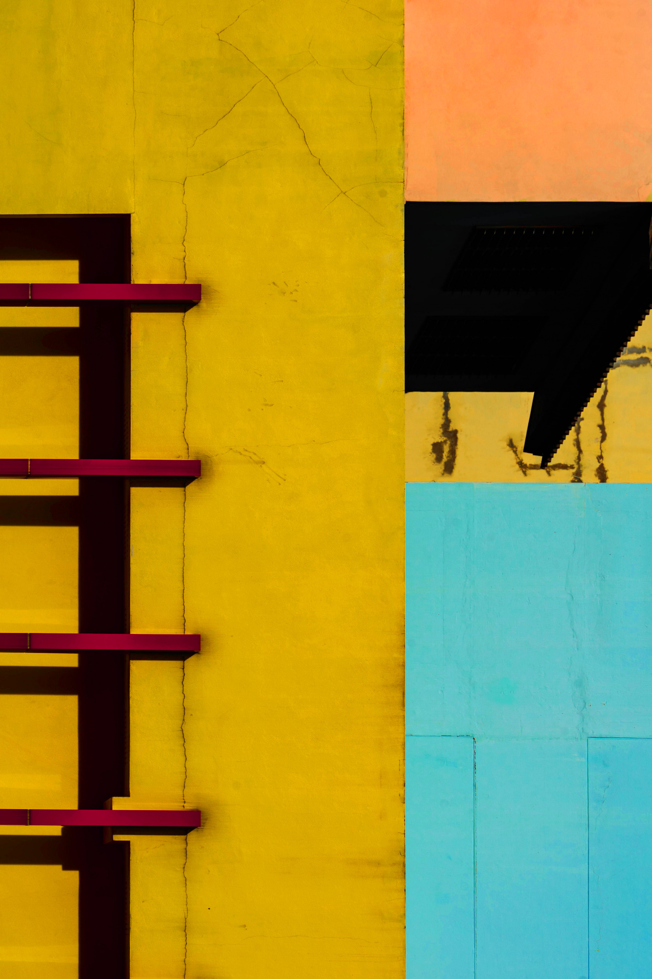
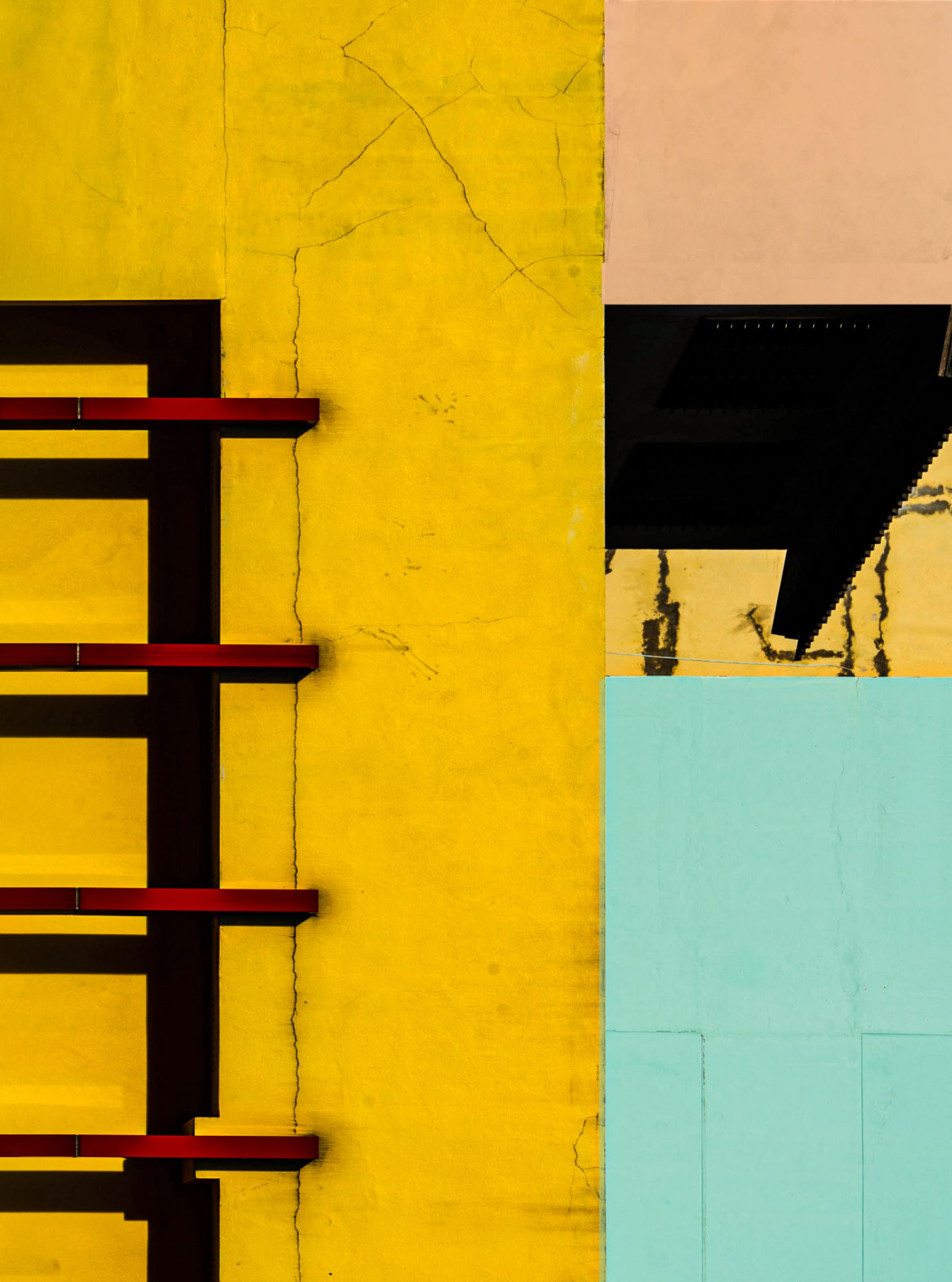
In my proposal for your photo, I proposed cleaning - removing some elements - cracks and plan on the walls, which negatively affected the eyesight and distracted the view from the whole photo and composition. In addition, I enhanced the yellow, red and blue colors to make them "talk" better. I didn't change the composition - it's good for me.
I made all changes in PSCC 2023 using individual colors and their masks.
Of course, this is my suggestion for your photo.
Regards
Slawomir Kowalczyk - SC.
Tepsarit,
You became already a good suggestion of Slawomir. With this composition you can play in several directions. I made two suggestions, in one I cleaned a fraction and the other a little bit more and I did a crop and turned. My advice is use this as examples and use your own fantasy. Theo-senior critic.
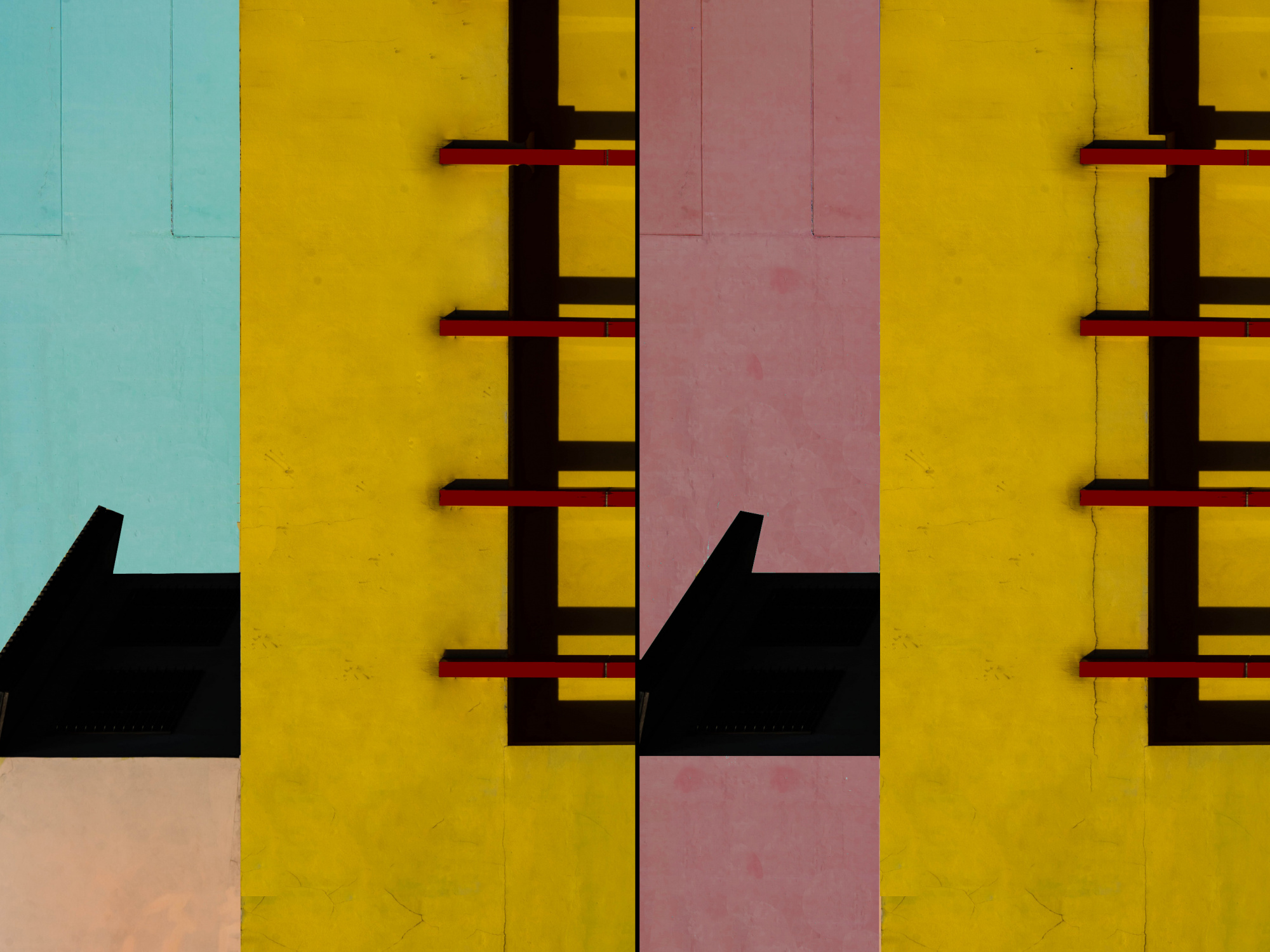
PS. If you have questions how to do let me know.
Hello, Tepsarit Lantharntong
Welcome to our forum. This is an interesting image. Thank you for giving us the opportunity to suggest improvements on your image. I would suggest to clean the cracks and others distracting parts. My friends have also suggested similar adjustments. In addition to cleaning cracks I also had a suggestion upon the black and yellow part. That part looks especially distracting. So I used the square marquee tool and I painted it in black. Next I used the selective color adjustment brush, and made minor adjustments to the yellow, pink, and red parts of the image. I did this to improve colors. Using the Hue and saturation adjustment layer, I also added some saturation to your image. My reasons were to refine the image as you wanted to show shape and color. Image editing is not disliked as it used to be. So, I think we can use technology for our benefit. I wish you good light. Cicek Kiral SC...
Dear Tepsarit,
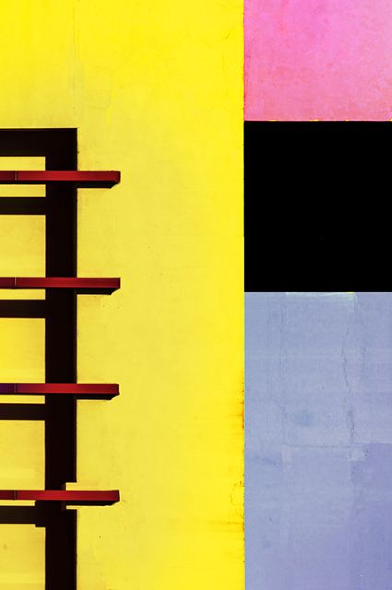
Thanks for submitting your photo to the critique forum. I like your image; it is a nice abstract in the made of urban textures. You already received a fair number of useful comments from my critics’ friends. I took your photo to Photoshop to make slight adjustments to apply the rule of thirds, so I added a bit on the left side of the picture using the horizontal ruler on the top left and then: Edit – Fill - Content Aware. And made some adjustments with editing tools.
I also made minor changes in the size of the pink square on the top right, so it is starting in line with the black metal bar on the left.
I also raise slightly the colors intensity.
I hope this may help you. It is of course just my opinion.
Best regards
Arnon Orbach Senior Critic

Thank you for your advice!