|
|
|
|
Hello all,
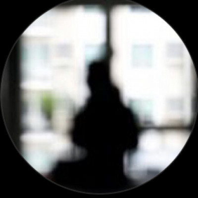
I am trying learn Silhouette photography so I am back again to get your feedback, opinions and suggestions regarding these edits of what is essentially the same subject in two different scenarios. One is a composite and the other is the actual image with just minimal edits.
Looking forward to what you all will have to say :-)
Thank you!
Martin
NOTE:
135mm
f/3.2
1/10000
ISO 100

Hello Martin,
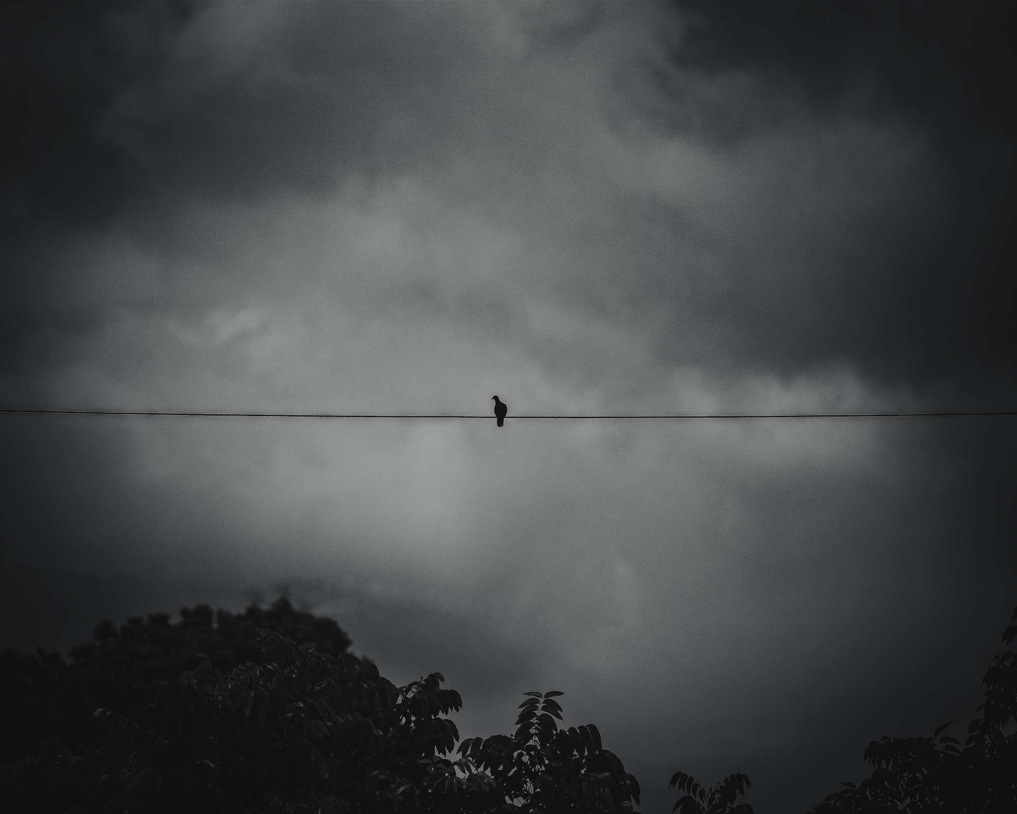
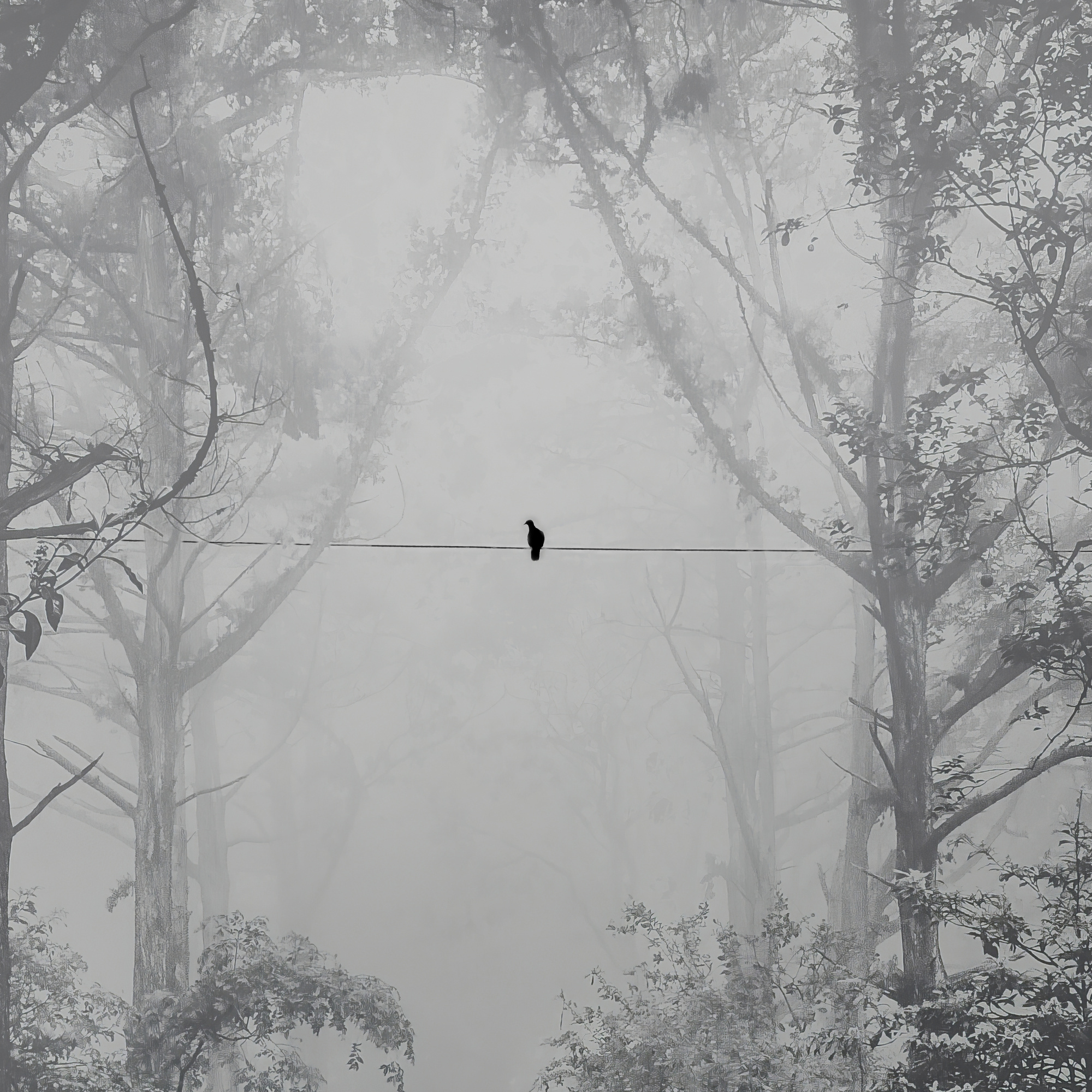
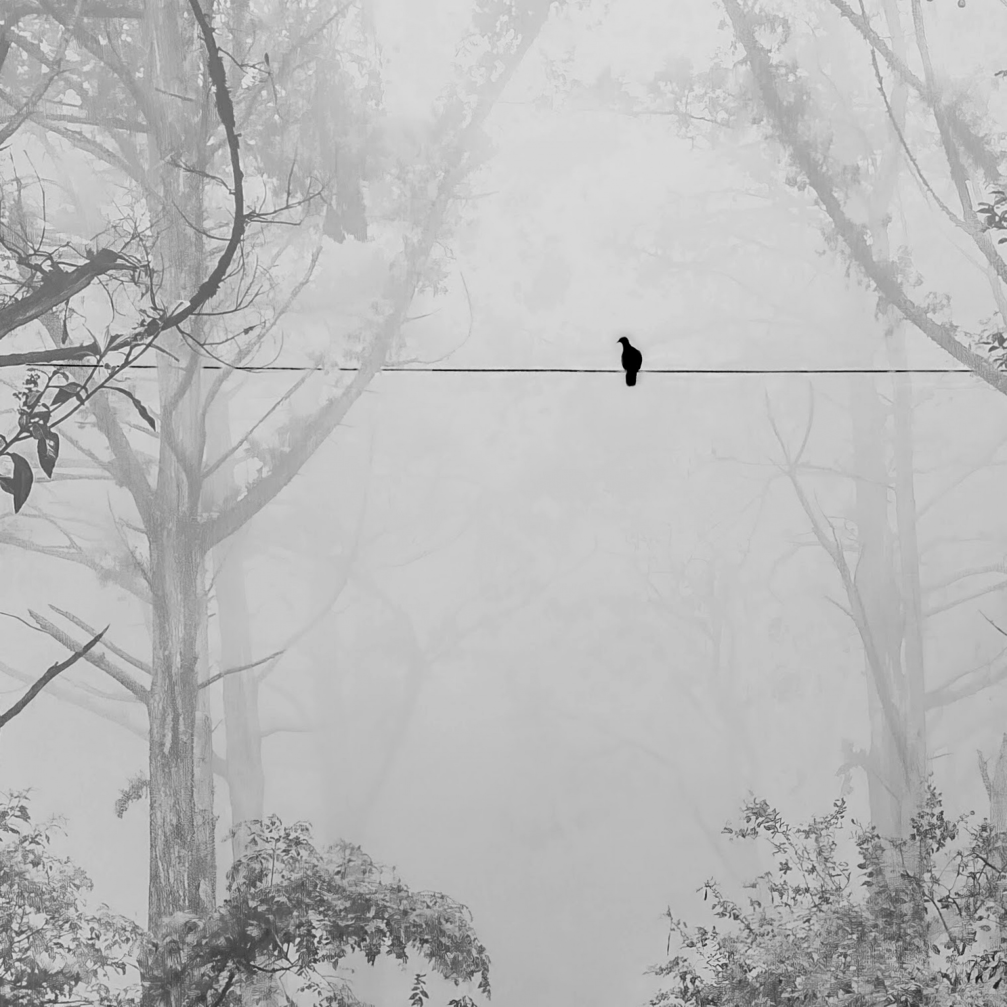
Welcome back to the forum and thank you for sharing these two photos. I think the first one is very dark, especially the silhouette of the tree in the bottom left corner. I prefer the second photo with the misty trees and foliage details. I would say in both cases that you could have a closer shot of the bird, so I have cropped the right side of the second image as well as the top of the frame. That also takes the bird a little right of centre, as the central position is not usually favoured. I also lightened the photo a little to brighten the murky grey. I still think you could crop more, but that's up to you of course.
Elizabeth
Thank you for your feedback, Elizabeth. I agree I think a close crop of the bird is the way to go.
Martin
Martin,
I'm guessing the bottom (lighter) photo is the composite. I think the wire and bird are too dark. They are at the same distance as the trees, so they should have approximately the same tone.
The top photo is more realistic. There is a dark smudge along the wire, and the bird being dead center is possibly not the best choice for composition.
. . . . . Steven T.
screen shot edited to lighten wire to match trees in mist

Hi Steven. Yes the second one is the composite. Thank you for your feedback!
Martin
Martin,
You became above very good advice for the strongest presentation. But earlier you was looking for negative space. And you had in my vision three weak examples. I think the dark one above may be not a perfect one but a better one for negative space than your earlier ones. Theo Lu
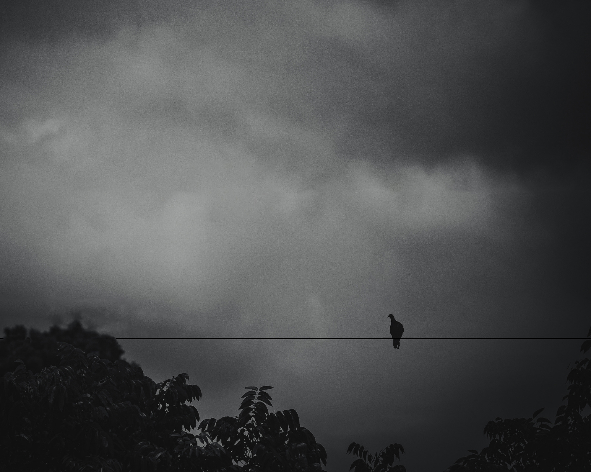
Thank you, Theo. I was actually going for silhouette photography with these exam. Out of curiosity what would make this image a better example of negative space?
Martin
Thank you, Theo. I was actually going for silhouette photography with these exam. Out of curiosity what would make this image a better example of negative space?
Martin
Martin,
I saw one of the three earlier photos was published. But for me were these not nice examples for negative space. And for me looks this better for negative space. Not for the quality but the composition. But this is my very personal vision for what it is. Theo Lu
Yes, Theo, I can see how you would see that. I guess there is a lot of overlap between negative space and silhouette. All the best.
