|
|
|
|

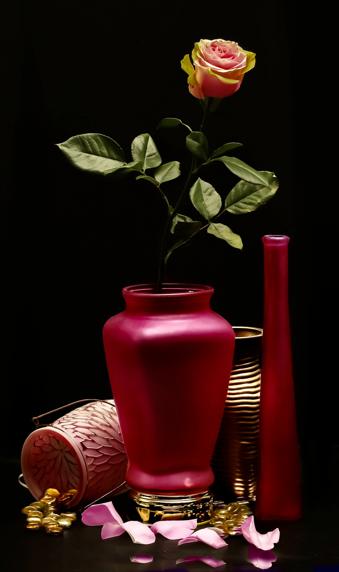
Blooming Pink and Gold”
Here I attempted to highlight the contrast between pinks and gold
using a China Rose in a deep pink vase and various
other objects. I was hoping to create aura of positivity.
Please comment on any or all of the following:
composition
Are there objects that I should have excluded?
Do the colors work for the intended purpose?
What is your opinion regarding lighting?
Are there problems with
Technical quality?
How could I have made the composition more interesting?
Canon 5DS R
iso 100
focal length 50 mm
aperture 8.0
shutter speed 1/200
lightroom Classic
Photoshop

Jlloyd,
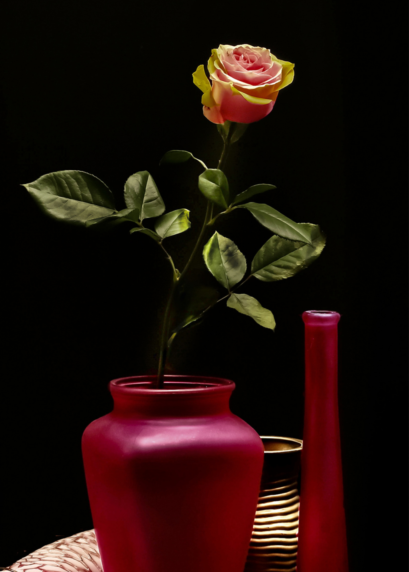
You asked about the composition. If I look to your image my eyes go directly to all below around the vase and at the same time to the nice rose, they are not together. I think you have to make a choice what is my goal in this composition and give this all attention. Make great work of this goal in all details. I played a little bit with this composition to give this quiet look. I will not say that this is the best solution but it give an idea. I also gave more attention to all details and the light around the stem and leaves. I saw your site and what you in my vision have to do is, remove below all disturbing details and make more quiet compositions to become awarded. LESS IS MORE. Theo L.
Dear J.,
Let me go straight to the point. Floral motifs on black seem to be your thing, and I don't believe that's a very common preference. Flowers are a delicate, gentle, emotional, lively and cheerful thing, black is the opposite. Your award balance of 5/60 may reflect this.
So I added at least some texture to your photo, maybe food for thought. I often use colored wrapping paper as a background when shooting flowers. Some color that corresponds or represents the complimentary color to the flowers,for more harmony, smoothness, warmth.
Another point you may consider is getting away from the displayinng style of photo. In my opinion, flowers have an attidude, a style. They can be vivid, smooth, delicate, sharp, you name it. When taking photos of a cerain type of flower, you may want to try emphasizing what you consider the "soul" of a flower. I have some flower photos that sold dozens of times, following that principle.People like beautiful things on their walls, and I like to create these. This one: https://1x.com/photo/1871693/useroverview/248636 sold now 28 times already, and it's ~ 1-2 more per month more since being pulished.
To your shot and your questions:
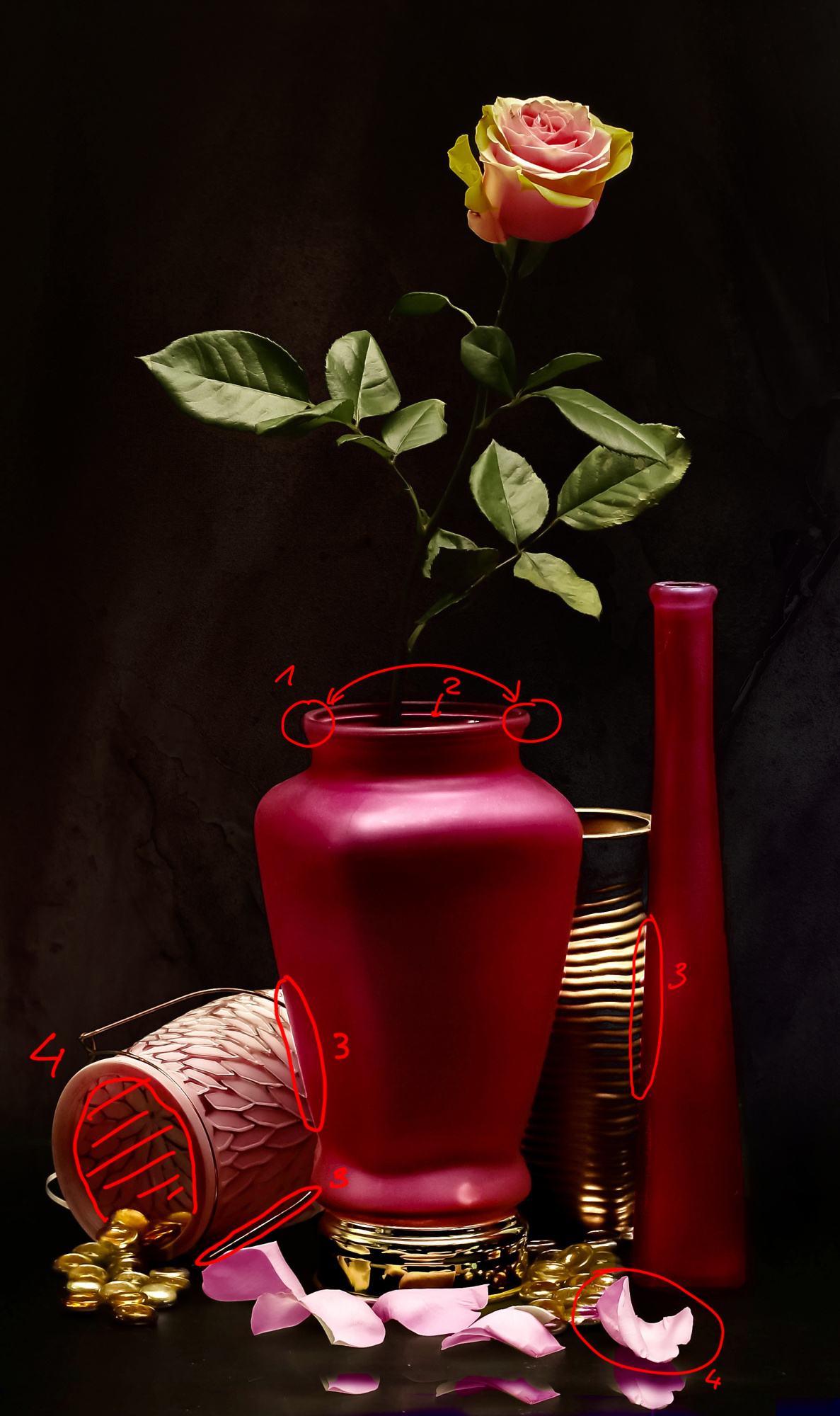
You have to improve the accuracy in editing or get the shots without editing. This counts for this shot, as well as many in your portfolio. I can find glitches in most of your shots, and 1x is about perfection.
If you compare the vase at point 1 and 2 you see you covered the round edge by a dark area.
I'd remove the ring marked with 2, it makes the vase appear cheap, as if it was plastic. Like the texture on it, to be frank.
At the points marked with 3 you see bright artfacts from either sharpening or other steps in editing.
I'd tone down the inner of what is marked by 4, again this looks like plastic. Ceramics would not be that translucient.
And last but not least, the leaf (also 4, sorry). It does not match the color of your rose, while you want to give the impression it fell off from it.
As you can see, I applied texture to the dark sectors, but not the bottom part. I did this to make the photo a bit more realistic and less hard in contrasts.
Best regards,
Mike
Jlloyd,
You asked about the composition. If I look to your image my eyes go directly to all below around the vase and at the same time to the nice rose, they are not together. I think you have to make a choice what is my goal in this composition and give this all attention. Make great work of this goal in all details. I played a little bit with this composition to give this quiet look. I will not say that this is the best solution but it give an idea. I also gave more attention to all details and the light around the stem and leaves. I saw your site and what you in my vision have to do is, remove below all disturbing details and make more quiet compositions to become awarded. LESS IS MORE. Theo L.
Thank you so much . This is helpful and I will carefully consider
Dear J.,
Let me go straight to the point. Floral motifs on black seem to be your thing, and I don't believe that's a very common preference. Flowers are a delicate, gentle, emotional, lively and cheerful thing, black is the opposite. Your award balance of 5/60 may reflect this.
So I added at least some texture to your photo, maybe food for thought. I often use colored wrapping paper as a background when shooting flowers. Some color that corresponds or represents the complimentary color to the flowers,for more harmony, smoothness, warmth.
Another point you may consider is getting away from the displayinng style of photo. In my opinion, flowers have an attidude, a style. They can be vivid, smooth, delicate, sharp, you name it. When taking photos of a cerain type of flower, you may want to try emphasizing what you consider the "soul" of a flower. I have some flower photos that sold dozens of times, following that principle.People like beautiful things on their walls, and I like to create these. This one: https://1x.com/photo/1871693/useroverview/248636 sold now 28 times already, and it's ~ 1-2 more per month more since being pulished.
To your shot and your questions:
You have to improve the accuracy in editing or get the shots without editing. This counts for this shot, as well as many in your portfolio. I can find glitches in most of your shots, and 1x is about perfection.
If you compare the vase at point 1 and 2 you see you covered the round edge by a dark area.
I'd remove the ring marked with 2, it makes the vase appear cheap, as if it was plastic. Like the texture on it, to be frank.
At the points marked with 3 you see bright artfacts from either sharpening or other steps in editing.
I'd tone down the inner of what is marked by 4, again this looks like plastic. Ceramics would not be that translucient.
And last but not least, the leaf (also 4, sorry). It does not match the color of your rose, while you want to give the impression it fell off from it.
As you can see, I applied texture to the dark sectors, but not the bottom part. I did this to make the photo a bit more realistic and less hard in contrasts.
Best regards,
Mike
Thank you so much . This is very helpful and I will carefully consider

Hello, jlloydphoto
Welcome to our forum. I can see that you have your own style of flower photography. I too like nature and flowers a lot and I tried a lot of still life using flowers on my self made canvas backgrounds. Lots have been out there in my portfolio. I had a look at some similar images of yours. The difference between them and the one above is about some disturbing details there are in the one you have sent here. The published ones look more meticulously worked on. My friends already gave you detailed explanation on the technichal improvements. I do not want to repeat same here. However, using the remove tool or a similar one that does the same job to clean dust particles on the surface would be advisable. I agree very much with my friend Mike Kreiten that the colors both in the backgraound and in the composition have a strong and domineering presence in the image. That is quite different from my appraoch to flower photography as I prefere to bring the subject more into a prior state in the composition. That is surely your choice of presenting your images. I advise you to keep on doing what works well for you. I wish you good light. Cicek...
Jlloyd,
You asked about the composition. If I look to your image my eyes go directly to all below around the vase and at the same time to the nice rose, they are not together. I think you have to make a choice what is my goal in this composition and give this all attention. Make great work of this goal in all details. I played a little bit with this composition to give this quiet look. I will not say that this is the best solution but it give an idea. I also gave more attention to all details and the light around the stem and leaves. I saw your site and what you in my vision have to do is, remove below all disturbing details and make more quiet compositions to become awarded. LESS IS MORE. Theo L.
Q
Hello, jlloydphoto
Welcome to our forum. I can see that you have your own style of flower photography. I too like nature and flowers a lot and I tried a lot of still life using flowers on my self made canvas backgrounds. Lots have been out there in my portfolio. I had a look at some similar images of yours. The difference between them and the one above is about some disturbing details there are in the one you have sent here. The published ones look more meticulously worked on. My friends already gave you detailed explanation on the technichal improvements. I do not want to repeat same here. However, using the remove tool or a similar one that does the same job to clean dust particles on the surface would be advisable. I agree very much with my friend Mike Kreiten that the colors both in the backgraound and in the composition have a strong and domineering presence in the image. That is quite different from my appraoch to flower photography as I prefere to bring the subject more into a prior state in the composition. That is surely your choice of presenting your images. I advise you to keep on doing what works well for you. I wish you good light. Cicek...
