|
|
|
|
Hi all,
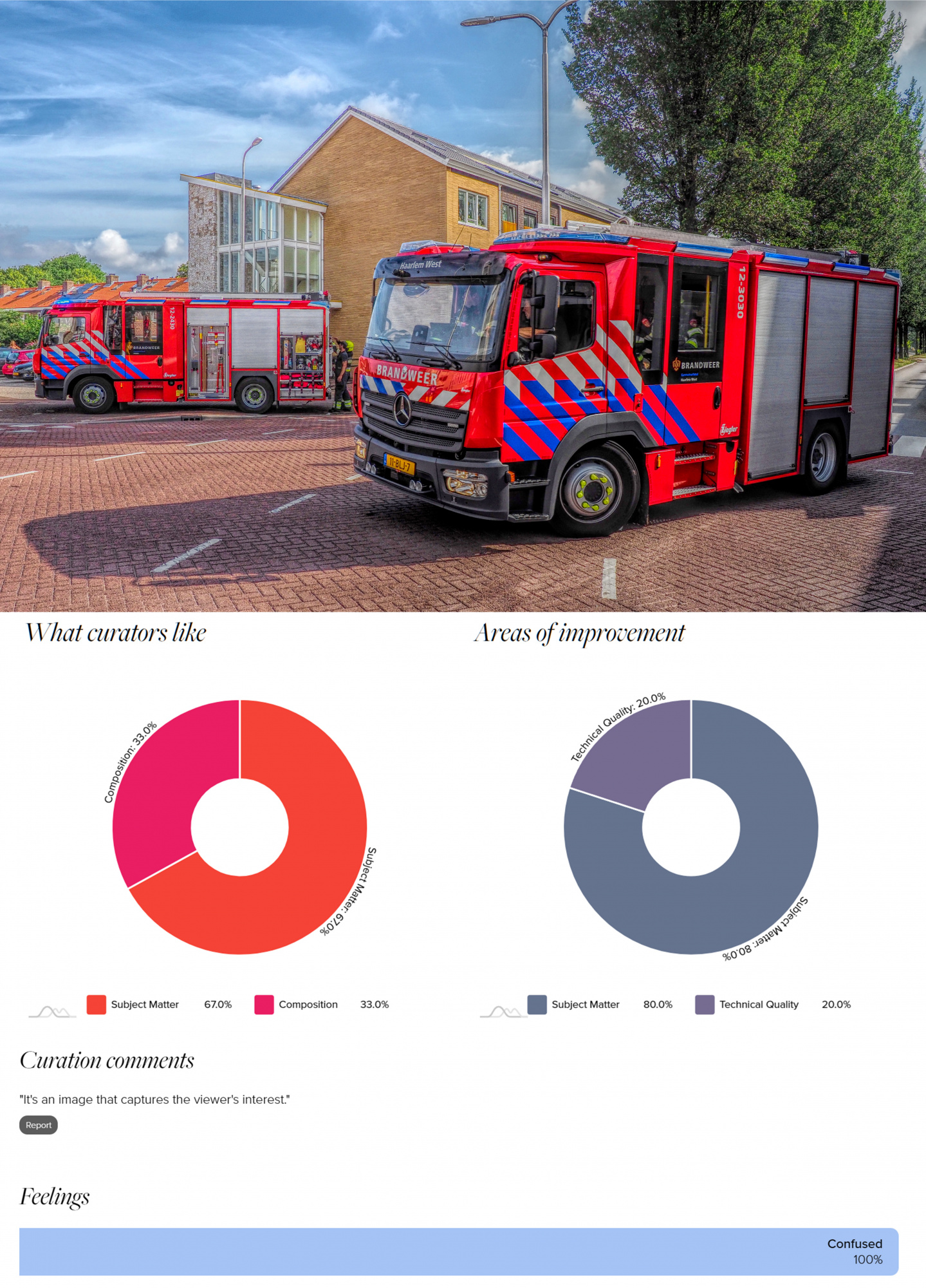
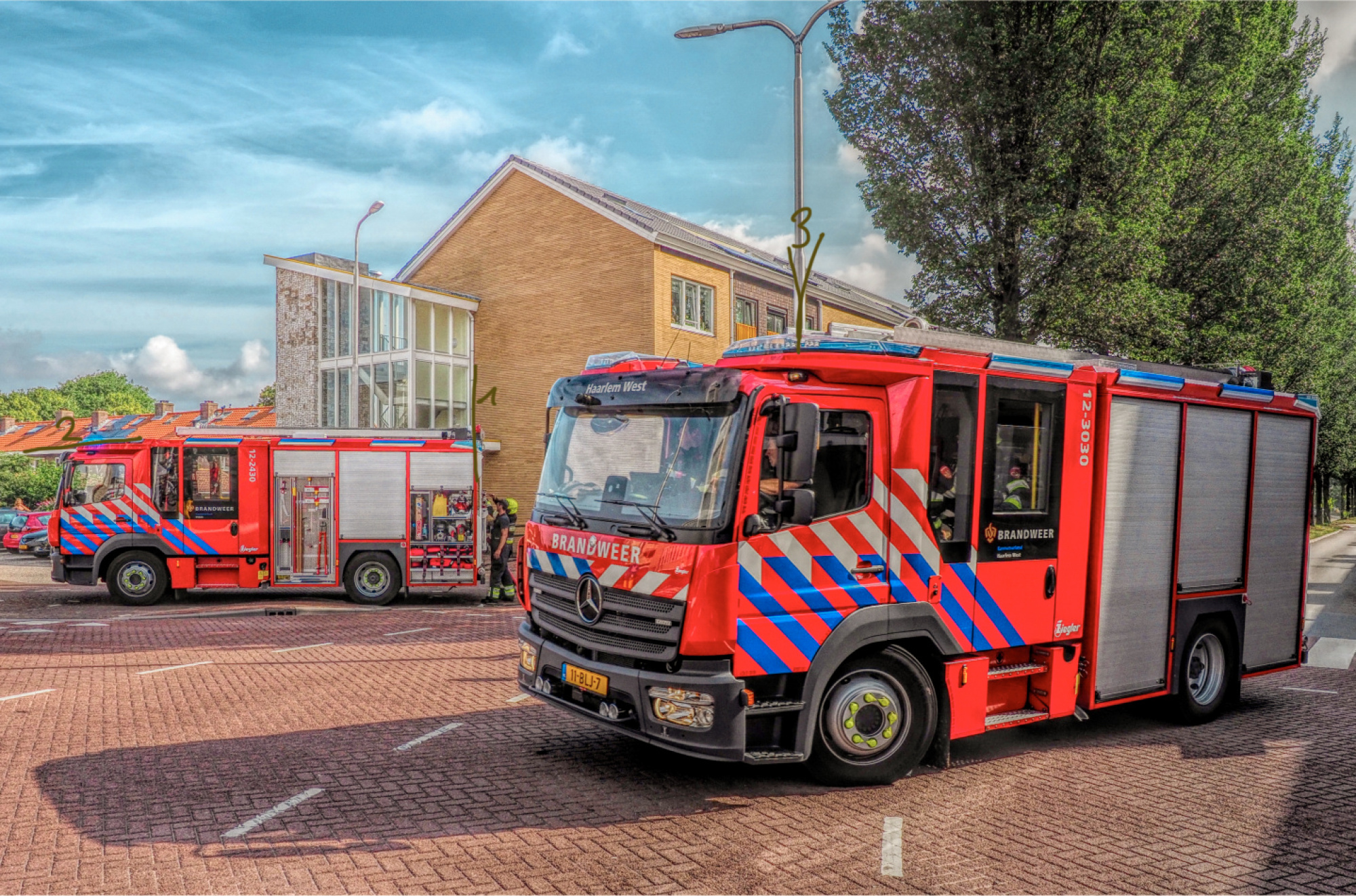
my photo of two fire trucks is not selected. I'm very curious why not. The photo comes from a reportage for the local newspaper and concerns a small fire in an apartment. The Haarlem-West fire brigade came to assist the Velsen-Zuid fire brigade. In the end it was a small fire.
Now the curation: The curators liked the composition (33%) and the subject (67%). The improvement percentages are technical (20%) and subject (80%).
As I understand it, you have to take these pie-chars with a grain of salt. Curators do not have to enter both the like and the improvement. That, I assume, makes these pie-charts strongly influenced by a small group of curators. Am I right?
The funny thing is that the subject gets almost the same likes as improvements ;-)
One curator indicated that he was confused by the photo. I cannot see what confuses him/her?
The photo is of course a reportage photo that has not been staged. After sending it to the newspaper I did make some edits. I cannot recall which ones they were.
So I'm curious what you think about the photo, what improvements do you see and how I can make this photo accepted?
Thanks in advance,
Ko van Leeuwen

Hello, Ko Van Leeuwen
Welcome to our forum. Thank you for sharing your image with us. Your image strikes me mostly with the bright red colors. Well When you daily check the published and awarded images on 1x you can see that these are mostly more of an artistic nature. In nearly all of them the viewer does not need extra information to read what is going on or what the photographer wanted to tell them in the frame. When posting an image I advise you to think of yourself as the viewer who was not there when the image was takemn. You as the photographer know even details the viewer does not even recognize at first sight. Here I see a colorful image with two Fire trucks. I do not see the fire and so an important ingredient is lacking to help me understand and interpret the image. The building in the back could as well be their station. Next as the journalistic evidence is patly present, let's talk about the artistc and technical sides. Unfortunately the composition is one that could have been taken by lots of people with a camera at hand. Please remember platforms like 1x look for moments, frames and stories that skilled photographers determine to capture and share with the world of photographers. Now every single guy with a mobile phone is a Photograph taker. Yet we here are those with keener eyes and different set of minds. I wish you good light ....Cicek
Hi Cicek,
in this photo one does not mandotary need the exta information. Maybe I should leave the discription out the next time. You can interpet the photo how you like. Their station, a fire, a exercise, you name it. And this photo is not really jounalistic anymore because of the modification beyond the basic reality. It is turned into a artistic representation of the fire brigade. And yes, I see where 1x looks for, but I think this photo artistically can fit. I's maybe more mondain than a lot of other photo's, but it is fact of life.
Greetings,
Ko van Leeuwen
Ko,
Thanks for sharing your photo with us in Critique Forum.
The photo is technically OK - sharpness, depth of field, etc. The colours are interesting with most of the photo in soft, muted tones that contrast with the extreme, saturated red of the fire engines. The trucks are positioned well, and the fire fighter in the background between them is a good detail. The scene looks clean and modern.
I hope you won't find this opinion too blunt - but I don't see the documentary or artistic value in the photograph. It seems a well-crafted record shot of two trucks - with some strong colour editing.
Maybe if there were a small child in the foreground, looking up at the big machines as if dreaming that someday when they grow up they will be a firefighter . . . . . then viewers would find a story in the photo.
Regarding the percentage scores and pie charts showing 'negatives' and 'positives' - they are often contradictory. We aren't told how many members vote, how quickly they vote, or how experienced they are at making and judging photographs. We also don't know how the mystery algorithm calculates the scores. The bottom line is 'Published' or 'Rejected'.
. . . . Steven, senior critic
Dear Ko van Leeuwen,
Here's some evidence you see an other picture, like Cecik already mentioned. I did not think it was their station, but the building behind a residence. I wondered if they were doing something really or just leaving the place, because the front truck is tilted a bit. But I did not think it was an exercise.
We see our photos differently than people not present at the time of recording, a fact.
Your color balance is quite far off, to name something to improve. Could be your screenshot doesn't show the real color, though. If your theme is firefighters, at least the red should be real(-istic). They tend to purple, as the complete phot does a bit.
Another aspect, if it was a more artistic photo, is the cross-sections with elements, these can be avoided:
I hope it gives you some insight from non-involved viewers to the scene.
Best regards,
Mike
Hi Steve, thank you for your interesting comment.
I hope you won't find this opinion too blunt - but I don't see the documentary or artistic value in the photograph. It seems a well-crafted record shot of two trucks - with some strong colour editing.
It was part of a serie where this photo supported the report that a second truck came to assiste the first truck. Singled out it is a photo of two fire trucks, you are right. Next I strengthened the saturation to make it a "artistic fire fighters photo".
Maybe if there were a small child in the foreground, looking up at the big machines as if dreaming that someday when they grow up they will be a firefighter . . . . . then viewers would find a story in the photo.
That's a good tip! But IRL kids have to stay on the sidewalk. But adding a kid in post is possible if I have the parents permission.
Regarding the percentage scores and pie charts showing 'negatives' and 'positives' - they are often contradictory. We aren't told how many members vote, how quickly they vote, or how experienced they are at making and judging photographs. We also don't know how the mystery algorithm calculates the scores. The bottom line is 'Published' or 'Rejected'.
As I see it if only one curator selects 'subject matters' and no other curator selects any thing this one curator make it an 100% score.
I hope you won't find this opinion too blunt - but I don't see the documentary or artistic value in the photograph. It seems a well-crafted record shot of two trucks - with some strong colour editing.
That is OK. I was asking for it ;-)
Thanks,
Ko van Leeuwen
Hi Mike, thanks for you comments.
Here's some evidence you see an other picture, like Cecik already mentioned. I did not think it was their station, but the building behind a residence. I wondered if they were doing something really or just leaving the place, because the front truck is tilted a bit. But I did not think it was an exercise.
We see our photos differently than people not present at the time of recording, a fact.
That's true.
Your color balance is quite far off, to name something to improve. Could be your screenshot doesn't show the real color, though. If your theme is firefighters, at least the red should be real(-istic). They tend to purple, as the complete phot does a bit.
Mike
I'm sorry, but I don't see the purple. And the color balance is on purpose saturated to make it a 'artistic fire fighter photo' beyond the journalistic/documentary photo. The standard red for Dutch fire trucks is RAL 3000 but I deliberately exaggerated it. My display gives a good represeataion of the color although different websites seems to disagree ;-)
1) out of the camera
2) the 1x version
3) the newspaper website (to dark!!)
4) RAL 3000 according to different websites ;-)
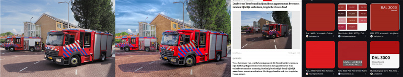
I hope it gives you some insight from non-involved viewers to the scene.
Mike, this is a very good remark which I will use.
Thanks you,
Ko van Leeuwen
